Like a lot of Londoners, my trip to and from work involves moving between a few different trains, any of which could be delayed and cause me to be late to work. Or worse – late home. As checked the tube status on my phone over breakfast one morning, I realised that it would be super useful to have some kind of display in my living room allowing me to see at a glance how my commute is looking before I set off, so I can go a different way if needed.
There are a few options to create a display like this – I could re-purpose a tablet or phone in the technology graveyard drawer, writing a quick and dirty app to run on it. But where would the fun in that be? Sure, it would work but I wanted to learn something along the way. I decided to use a Raspberry Pi and a display of some kind, but if its going to live in my house, it needs to be pretty.
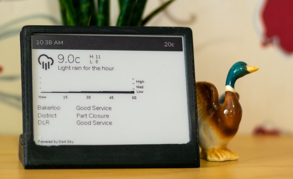
I ordered the Primoroni Inky wHAT – an eInk display with all the headers to screw it directly onto a Raspberry PI. It even has Python library for displaying stuff. I went for the two-colour red/black model; I thought I could use the red mode to make any tube status issues stand out.
Features
As soon as I’d ordered the screen, I started thinking about what I would use it for. I came up with a few things I wanted to do:
- Display the current tube status of the most useful tube lines
- Display the current weather / temperature outside from DarkSky
- Show the current indoor temperature, pulled from my Air Quality Monitor (I built this a couple of years back, I might cover it in a later post)
- Display some kind of indication that central heating is on or off
- Show the time
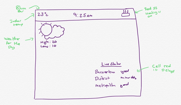
I drew this little diagram to get started:
Implementation
APIs
Ever the software engineering project, the first task was to investigate the APIs to give me the data I wanted.
- For tube status information I’m using the TfL Unified API. It’s easy to use, well-documented and free.
- For weather information, I’m using the Dark Sky API. It’s also easy to use and is free for 1000 requests per day
- Data about my indoor air quality is already posted to Adafruit IO, so to display it on screen I’m using their API and Python library to read the data back.
Scheduler
With a working understanding of the data I wanted to show and the limitations of the APIs, I started building a Python Script to show it. To show the time, I would have to re-draw the UI once a minute at the very least. The tube status can suddenly change, but generally doesn’t show too much variation, so a reasonably slow refresh of every two minutes is probably acceptable.
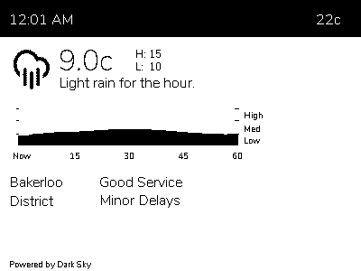
Dark Sky was an interesting one, though – The free API tier allows 1000 free requests per day, not quite enough to update every minute. When I first started I showed the forecast for the next hour, for this a 10 minute update cycle seemed reasonable. As the scope crept project matured I added the Dark Sky precipitation graph, showing the minute-by-minute precipitation quantity for the next hour. Suddenly knowing it was going to start raining somewhere between right now and in 10 minutes time was not super useful. So I settled on every two mins.
To get started I simply had a while loop fetching the API data for each data source, rendered it and went back to to sleep. But this had a problem – if there’s connection issues or one of the sources is slow to respond, the screen refresh can start to drift off schedule and display the time incorrectly. I needed to isolate the screen refresh from the data refresh, so each data source could get its data at whatever frequency made sense to it, while the screen would update with whatever data was most recently fetched.
I’m pretty sure there’s some package I could have used to do this for free, but I wanted to learn from this project, so I set about making a little scheduler, that would allow me to register “plugins” that have their execute method called at the frequency of their choosing. Each plugin has a method for updating its data, and one for creating the UI fragment (see below). I made sure to add some careful locking to prevent issues from these two things happening at the same time.
UI
As I mentioned before, I wanted this to be pretty. I also wanted it to be something that I could tinker with pretty quickly on – adding new features or data as time went on.
The Inky wHAT Python library works by taking a 400×300 pixel image with a custom colour palette. Using the Python Image Library (or its still-supported successor Pillow), you use the APIs to add text, shapes or other images, then send it to the screen for display. The thought of building up the entire UI using as one monolithic bitmap, placing everything in the exact pixel location it needed to be, didn’t sound an awful amount of fun (or a scalable, well designed, way to draw a UI… But primarily, it was no fun).
I wanted to build the UI using an established UI language, then render it to an image for presentation. My first thought was to write the whole app as a .NET Core app, drawing the UI in XAML, but unfortunately XAML is currently only supported on Windows platforms.
The next plan was to draw the UI as a HTML page and render that image. This plan has some cunning advantages – the entire app for fetching data and generating the UI could be hosted in the cloud, with only a small on-device script that loads the page using one of the many browser automation tools, takes a screenshot and dumps that to the screen. This means that I could effectively update what the screen does / shows instantly by deploying an update to the web service. Ultimately I passed on this approach because it was a bit of a pain to get set up and contained a few too many moving parts that might be problematic over time. I didn’t think that remote controlling a headless browser would age too gracefully.
While the idea of generating the UI somehow is still alive, I decided to push forward with creating the images using PIL(low) manually. That said, I did do some work to make this as painless as possible – rather than generate one awful image, each data source now generates the image for its data only and that is assembled into the larger image.
I have plans to build this into something resembling a StackPanel / FlexGrid that just stacks up the images down the screen. I’m pretty sure merging the images together in this way is not fantastic for performance, but the screen redraws once every 60 seconds on a dedicated device, so its acceptable (for now).
You can see this in the bellow fragment – a simplified (for demo brevity) version of the TfL plugin:
def _writeToImageInternal(self, inkyColours):
    image = Image.new("P", (400, 60))
    draw = ImageDraw.Draw(image)
    font = ImageFont.truetype ("Nunito-ExtraLight.ttf", 16)

    requiresColour = False
    draw.text((0, 0), "Bakerloo Line", inkyColours.Black, font)
    draw.text((100, 0), self._bakerlooStatus, inkyColours.Black, font)

    return PluginImageResult(image, requiresColour)
When instructed to build the TfL UI, the plugin creates a new image and draws the line names and their current status. It then returns an object containing its rendered image and a bool indicating if a colour refresh is required, or a simple black / white one will suffice.
Debugging
When I first started working on this project, I screwed the inkyWHAT to a spare Raspberry Pi 2 and used Visual Studio Code’s SSH connection to write code and test it on the screen. However, I found that I tended to be working on this late at night or while half watching TV, meaning the screen was hard to see, or the other side of the room. Deploying to the device and waiting for the screen to refresh became a painful workflow. I therefore made a “debug mode” that would switch between displaying the data on the actual screen, and writing it out to a PNG in the project route.
The Case
Continuing the theme of things being pretty, I didn’t want his to be bare circuit board with some text on it. I’m no fabricator, though, so this would be a bit more complicated; Fortunately, I came across this case on thingiverse that my friend’s son kindly printed for me (side note, I quite want a 3D printer now, any recommendations?).

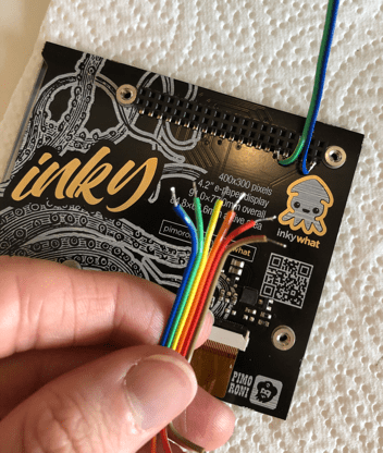
The spacing on the case is quite tight and requires you to solder directly to the Inky wHAT and Raspberry Pi Zero (the switch from Pi 2, to Zero W is going to come back to bite me, but more on that later). Fortunately, I had a rather nice length of ribbon cable to hand:
Unfortunately, I’m dumb and the idea of measuring twice and cutting soldering once evaded me – It fitted perfectly… Provided the Raspberry Pi was on the other side of the case to all the support lugs and port openings. So now it’s a confusing bundle of identically coloured cables. Oh well.
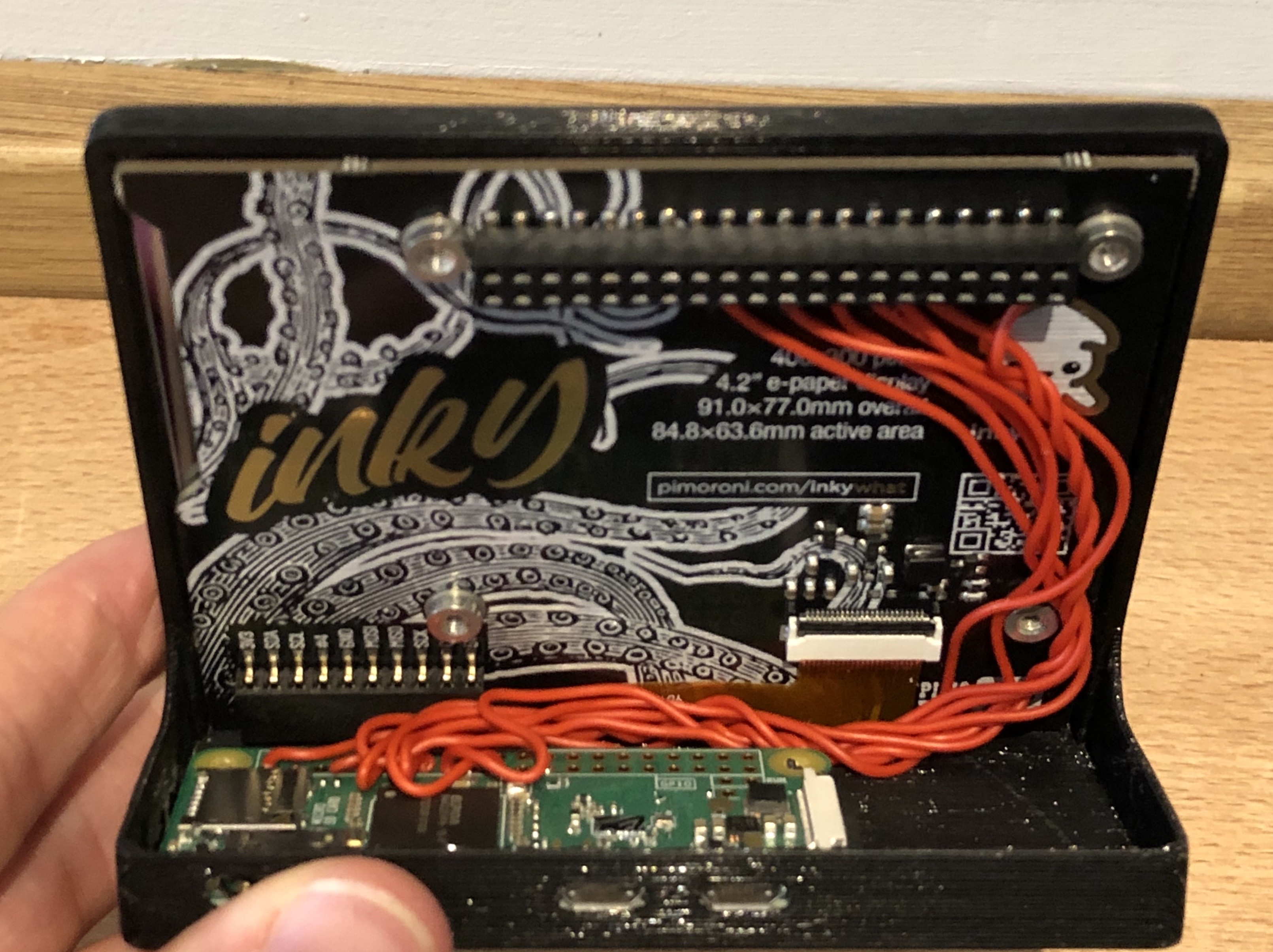


Anyway. With everything clipped together it looks amazing.
When used as intended, the Inky wHAT functions as a Raspberry Pi HAT (hence the name) – with a female header that attaches perfectly to the Raspberry Pi’s male GPIO header, however with this arrangement I only need to solder up the cables that it actually uses. To figure this out, I looked though the Inky Python library and figured out how it works. In the event you want to do the same, here’s a list of the required pins (you can get a closer look in the above photo):
- 3.3V (Pin 1 or 17)
- Ground (Pin 9, 25, 39, 6, 14, 20, 30 or 34)
- GPIO 17 Pin (11)
- GPIO 27 (Pin 13)
- GPIO 22 (pin 15)
- GPIO 10 / SPI0 MOSI (Pin 19)
- GPIO 11 / SPI0 SCLK (Pin 23)
Problems
It did not all go exactly to plan, I hit some issues along the way. Lets talk about them now.
ARMv6 Disappointment
I started working on this project by attaching the screen to a spare Raspberry Pi 2 (not the 1.2 revision) I had in a cupboard, and used Visual Studio Code to write and debug the code. This works by automatically connecting to the Pi over SSH and installing a remote debug server on it. This works perfectly, I highly recommend it as a work flow.
It wasn’t, however, until I had permanently wedded the only Inky wHAT I own to a Raspberry Pi Zero and tried to repeat the feat, that I realised the Pi 2 and Zero have different instruction sets; the Zero’s ARMv6 instruction set was not supported by Visual Studio Code. There’s an issue tracking this on GitHub and I believe there’s a version now available for insiders, but it didn’t help me much when I first hit this.
Warm Reload Mode
eInk is a really interesting technology, for more details I there’s a really good video here, but at their simplest eInk screen are made of an array of little balls filled with a black oil. Suspended in the oil are charged particles of a reflective substance. When a current is applied to one of these balls the particles move to the front and it appears white (or that special kind of beige familiar to original Kindle users). When the inverse current is applied, the particles move to the back and the cell appears black.
There are two consequences of the screen working like this – one, each cell can be somewhat affected by the charge of the cells around it meaning that after a few refreshes, fine text can start to have some “dust” appear around it. The other issue is that if the same current is repetitively applied to a single cell, it can become perinatally charged and some of the reflective material will refuse to move.
To solve both of these problems when an eInk screen is refreshed it first blanks every cell to black, then white before finally showing the desired image. This ensures that everything is in a nice clean state each time something is shown. This can get pretty ugly, so Kindles don’t do this in every refresh – instead doing it on every 5th page turn. If you look closely, you can see the image quality getting progressively worse until the blanking happens, and then it all looks clean and nice again.
My screen has a lot of data on it that updates infrequently, but refreshes every 60 seconds to update the time, so I thought I’d like to do something similar. I forked and modified the inky Library and added a “warm refresh mode” that adjusted the timing matrix to omit the blanking stage. I then made my app use warm refresh mode for 9 refreshes and a normal refresh for the 10th.
It looked fabulous, exactly what I wanted. But as the day went on, I noticed that the red “Planned closure” text of the tube status was getting fainter and fainter. After about a 100 iterations thought the cleaning script, you can still make out a feint outline of the text when a full red box is shown. Oops.
So, I parked that idea. I hit it behind a config option with a big warning to any people brave enough to try it and vowed to come back to this. In the event you want to try something similar, please be careful, this could permanently damage your display.
Eight Hour Crash
While still a work in progress, I eventually got to a point where I thought it was good enough to start leaving the screen running over night to check the tube status on my way to work the next morning. It all worked perfectly when I got up, but by the evening, it appeared to have crashed. This continued to happen another couple of times before I got a chance to investigate.
Really strangely the script had not crashed as I had thought, but appeared to still be running. Only the screen was not refreshing and in some cases, the Dark Sky or TfL feed would be showing the generic “error fetching data” message that I added. Very odd. Most odd of all, was when I looked at the time shown last time the screen updated, it was always about 8 hours after it was started. Hmm.
I added a lot of logging and left it running again. Sure enough, eight hours later it had died. Only this time I had some information:

Too many open files, huh? I wonder how many:

Yup. 1025 open files, that very suspicious. So what files are they?
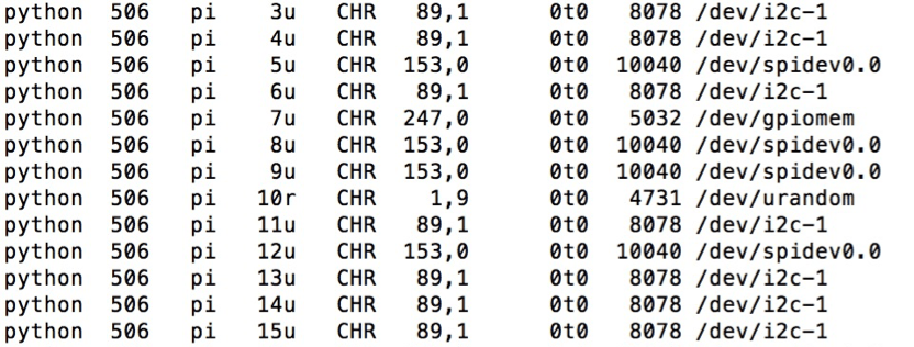
What I learned is that every time you create an instance of the Inky library it opens connections to the i2c and SPI ports so that it can communicate with the screen. However, it never closes those connections once the instance goes out of scope. The initial version of my script created a new instance on each refresh so that it could skip in and out of colour mode as needed. Simple fix – create the instance up front and keep it around.
The Clock Is Wrong
For simplicity, the scheduler polls each of the plugins every 10 seconds, and runs the plugins at their required frequency. In the case of updating the clock, this means every 60 seconds from when the scheduler starts. Not at the start of each minute. This means that while the clock updates once a minute, it doesn’t update when the minute changes like a normal clock. Indeed, in the worst case scenario could be up to 59 seconds slow. Just more things on the list to come back at later.
Going Forward
This isn’t a finished project, nor will it ever be – it’s a something for me to tinker with in my free time. So here’s a list of things I want to add, change or fix at some point:
- Add support for National Rail departures
- Fix the clock issue from above
- Revisit warm refreshing the screen
- Add some kind of auto updater that monitors the git repo and updates when I push
- I’m going to take the screen protector off! You can see in the above photos that I forgot to take the screen protector off that protected the screen during transport. There is a little tab in the bottom corner. Next time I take it apart, I plan to remove that 😉
Code
For reference, I’ve published all of my code for this project to my GitHub. Do bear in mind though that I intended this mostly as a reference as to how it worked. So it’s a bit specific to my implementation rather than a super configurable app.
Feel free to use this to get started and make something of your own, though. If you do, I’d love to hear about it. Drop me a comment or tweet me @andycb.

One thought on “Building an eInk Info Display For My Living Room”